This post was made available to Patreon members on August 15th, 2022. If you would like to support Socially Distant’s development while gaining early access to these devlogs, feel free to support acidic light on Patreon!
Socially Distant is an up-coming hacking game coming to Steam on Windows and Linux. Like any game, it needs a logo and icon to stand out from the crowd. Do you really want to open your Steam library and have a blank banner with generic text saying what the game’s called? Some people might, but we certainly don’t.
The game takes place in a world undergoing a pandemic similar to the 2020 global pandemic of our own world. You play as a recently-graduated ethical hacker who is falsely accused of creating malware that disrupts society and the healthcare system. It’s your goal to find the origin of the malware and clear your name. We needed a logo that would depict this story at a glance.
Finding an Artist
Perhaps the hardest part of this project was finding someone who could help. Michael, the project’s creative director stated:
I know my way around a basic image editor and can recolor things if I need to, but… you don’t want me doing a logo from scratch. Leave me to the programming and game design side of things.
This was honestly a several-month endeavour. We started by putting out a B.O.L.O on Twitter for any graphic designers who were looking for work. Unfortunately our following isn’t that huge and we mostly ended up with bots. Agh, that’s no good. In true Hollywood script-writing fashion however, Michael had an internal realization.
Luckily, I remembered that I knew a guy who happened to know a guy who happened to know a thing or two about designing logos for many things, not just games.
Michael reached out to his friend AlpineShowTime. Alpine used to work on the art side of Restitched and they became friends through both being part of the Restitched development team. Alpine was able to get us in touch with one of his friends, Nicholas Guilbault. We reached out, and Nich was extremely happy to help out.
Initial Concepts
The first part of any graphic design project like this is to get an idea of what we actually want things to look like. When working with a graphic designer that’s not yourself, you need to communicate your ideas and inspirations so that the two of you are on the same page.
This involved Michael whipping up a document describing absolutely every idea we had. The game’s story, the idea for the in-game operating system, screenshots of an actual build of the game, and even examples of other games whose art style Michael wanted to align with. And because his blindness makes it extra hard for him to communicate ideas visually, we even provided some game soundtracks that convey the same feeling we want to in the game.
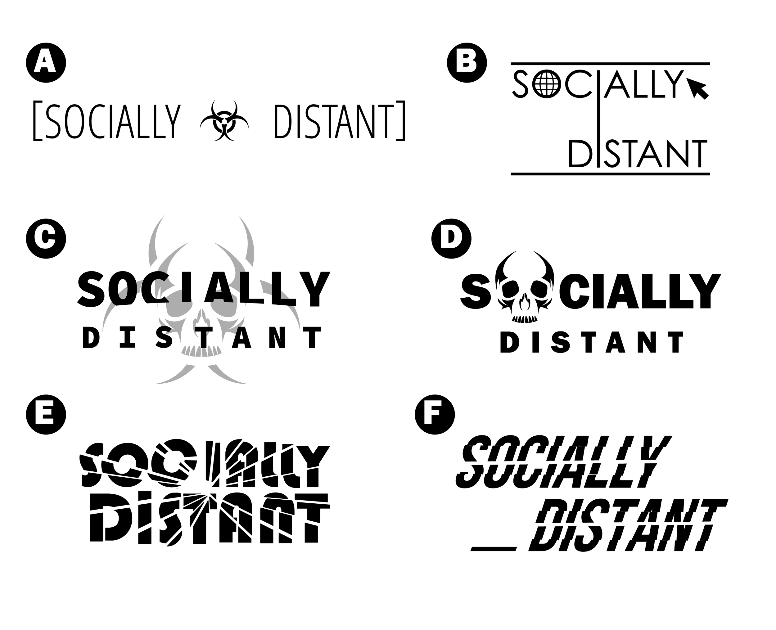
It proved helpful, because a week later, Nich sent us the first design concepts for the Socially Distant wordmark.
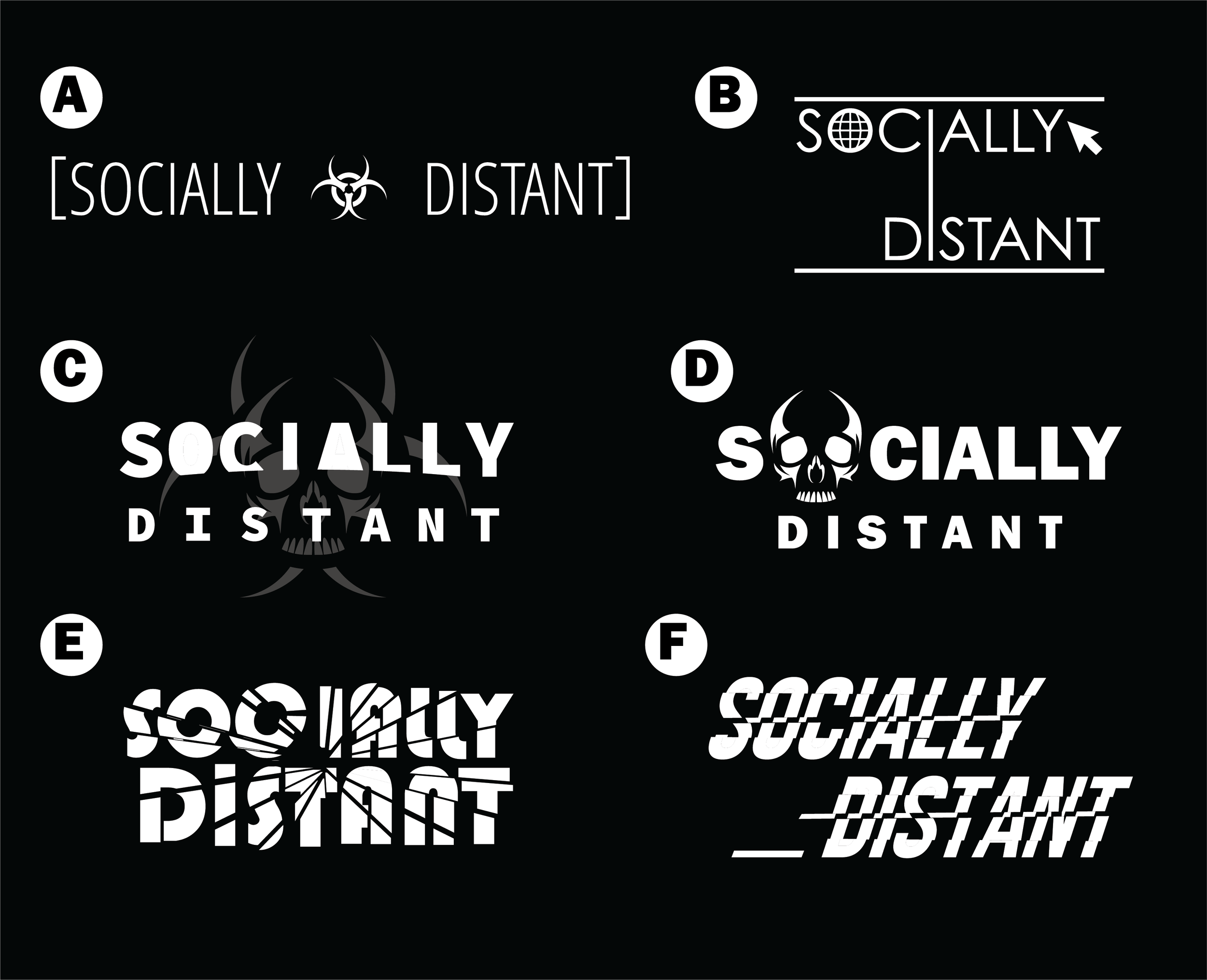
And the dark mode ones too:
Nich also provided blind-accessible descriptions of each logo concept, which are provided below.
A and B: Here I tried to play up the “distancing” aspect in the typography, emphasizing the feeling of emptiness using more negative space and a lighter typeface. “A” emphasizes the biohazard aspect more with the symbol in the middle, while “B” plays more on the computer aspect with the possible inclusion of a web icon or a computer cursor.
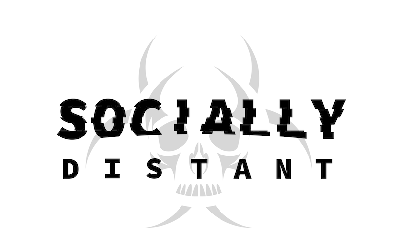
C and D: With these I amped up the feeling of danger and urgency with a heavier typeface and the inclusion of some skull iconography I whipped up.”C” also incorporates the biohazard symbol, and I had the idea of spacing out the letters more for the word “distant” to give it some more interest, while in “D”, the skull takes the place of the “o” in “socially”, incorporating the image into the type.
E: With “E” I had the idea to give the text a “shattered” look by separating it into fragments in a starburst pattern and offsetting them all slightly, giving the title the appearance of “breaking” and shattering outwards. I think this is a pretty interesting effect if we want to go this route, but the downside is that it’s a little busier, so it becomes more difficult to work an icon / image in there.
F: Finally, “F” borrows from the Watchdogs reference you sent me by emulating that “glitch” look in the text by offsetting fragments of the text horizontally, almost like a damaged digital recording.
With so many options to choose from, we had no idea where to even begin.
Picking a Direction
It was now time to make a choice. Michael had several options presented before him and, given this logo would need to represent my game for a long time, the choice needed to count.
Michael started by sharing the concepts with close friends and getting their feedback. That way, he could make a decision based on notes from people with good eyesight instead of just relying on his own judgement. He could then take that feedback to Nich later once he made a choice.
Some people preferred A and B, others C and D, others E and F. But out of everybody I asked, there wasn’t necessarily a favourite. It’s as if all of them were really great and it ended up needing to just be Michael’s personal preference. So he slept on it for a bit. Michael reflected:
There was just something about C… something that just felt… right. I closed my eyes and tried to imagine all 6 logos being used but… as I kept thinking about it, the only one that really stuck out to me was C. So that’s what I went with.
Improving Perfection
Even if the third logo called out to Michael, he knew that these were just initial concepts. He wasn’t quite ready to let it be the final logo. Even if he already thought it was perfect, he knew that it could use some improvement – but he wasn’t sure what. He reviewed notes from his friends.
A friend told me that it could use some subtle glitching effects like the Watch Dogs logo, and I agreed.
So we sent this along in our feedback notes. And Nich got to work.
Not long after, he came up with a second round of concepts based on Logo C and the feedback.
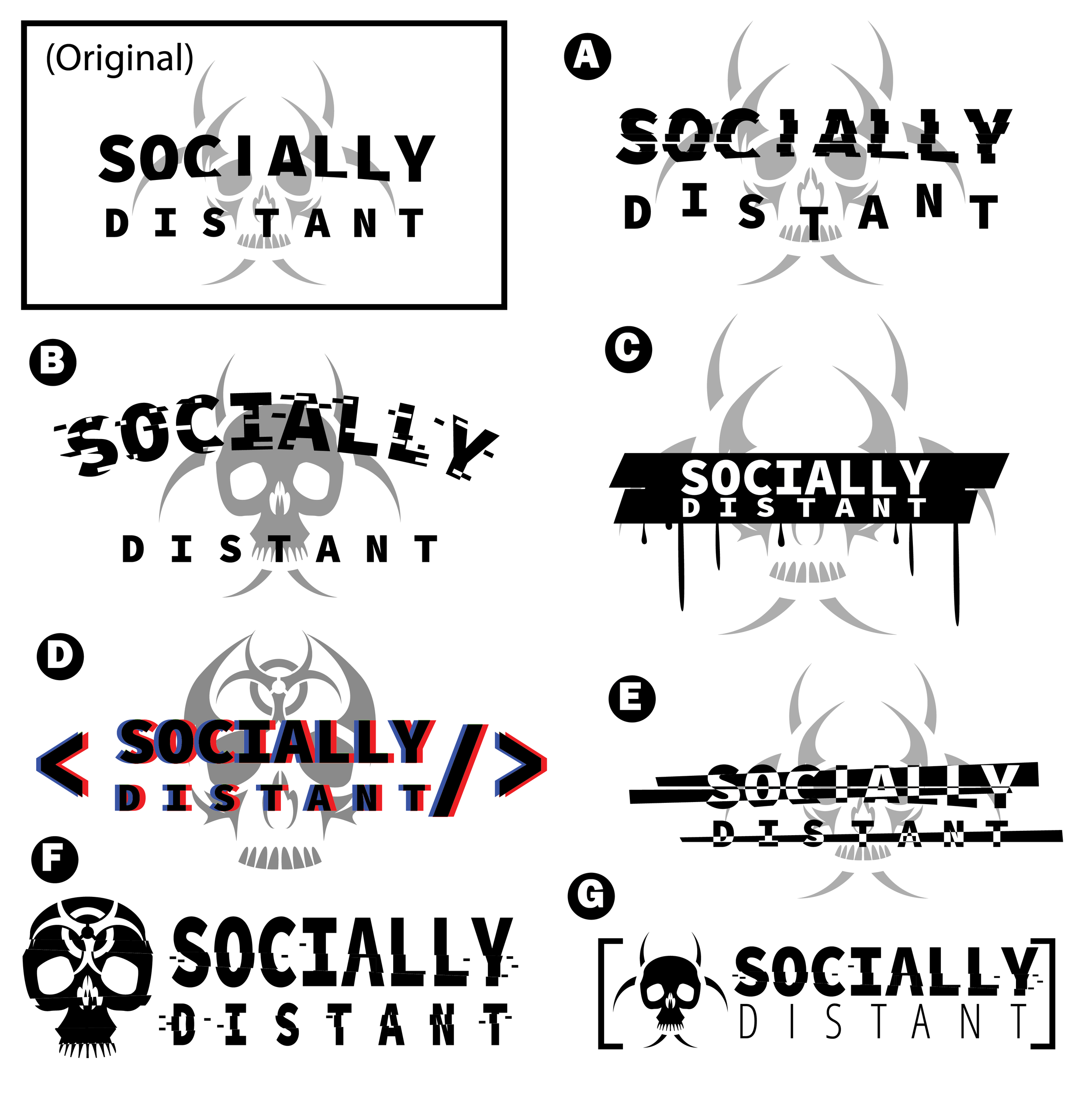
As we looked them over, we decided that Logo A would work the best. But Michael wasn’t keen on the “DISTANT” text being wavy as shown above. He felt that it took away from the serious nature of the game that he wanted to portray. We also agreed to tone down the glitching on the “O” in “SOCIALLY” to prevent it from looking unintentionally italic. This became our base logo – which you can see right here.
The Finale
With the main logo completed, Nich worked on creating different variations of the logo for use in different situations. Icons, banner variants, and vectorized versions of the logo.
Michael worked on creating variations of the logo for use on Steam, Twitter and Discord. We can’t wait to show you what the Steam page and library will look like, but you’ll just have to wait and see when the game’s store page launches later this year.
We’re really happy with how the logo turned out. You can see it in use right now on the Socially Distant Twitter and Discord servers. Nicholas is incredibly talented and we highly recommend you guys check him out.
And we should thank you too!
Because it’s thanks to our lovely Patreon supporters that we were able to afford this logo project, and other graphic design projects as well. This post was made available as one of the first ever Patreon-exclusive devlogs for Socially Distant, and the support since launching the Patreon really means a lot!