
Computers. They’re great. You can write, save, open and delete text documents. You can check what time it is. They let you change the desktop background, explore all kinds of cool applications and the Internet, and you can turn them off. All this, while being infinitely frustrating as hell when you can barely see the big glowing rectangle of agony we call a screen. As a society, we have come so far in the innovation of displaying true life-like colors on these dominating quadrilaterals. We even figured out that some users need the colors to be inverted, others need to zoom in, and more people need their monitors to borderline being as wide as some humans are tall.
As programmers and application designers, we have collectively figured out that most things on the screen need to be consistent. We’ve figured out that, if a user needs dark text on a light background, that the user must always be able to have dark text on a light background. If they need the opposite, then damnit, let there not be light. Plunge ‘em straight into the darkness, the night, the black abyss in which I happily sit typing this text - knowing I can actually read it with my actual eyes.
And then there was this.
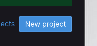
This brain-meltingly bright rectangle is the “New Project” button on GitLab. I can’t READ it, but TheEvilSkeleton can - and I’m lucky enough to be their friend, therefore allowing me to have this knowledge.
And it’s not the only case…
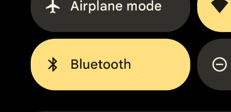
There’s the active quick settings tiles of Material You, that are decidedly not for me:
There are various buttons and navigation tabs in Discourse forums (like the Socially Distant one), that are only slightly easier to read:

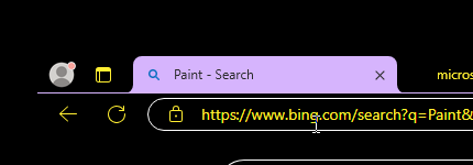
And the most egregious example, the active tab of Firefox (and various other browsers) in the High Contrast theme (supposedly DESIGNED for the blind) on Microsoft Windows.
Every time I see something like these, I growl at the world and then let out a depressing sigh knowing the only thing I can do about it is to complain on a blog that virtually no one knows exists.
So what’s the actual problem?
The main problem is the bright backgrounds. All of these buttons/tabs either have extremely bright colored backgrounds, or something close to a pure white background. While most of the page/interface around them is dark with light text, these interface elements go out of their way to stand out by being obnoxiously bright.
In the case of GitLab, the button commits a violation of the 10 commandments of accessibility, thou shall not put white text on a bright background. Don’t we have tools that help designers never do this?
In all other cases, the on-paper contrast ratio (that is, the absolute difference between background color and text color) is fine. If the font were bold and/or spaced-out enough, these buttons would be perfectly readable. However that is not the case, and the font is far too thin. For people like me, this causes the bright background to bleed over the text making it appear either fuzzy, faded, or out-right invisible.
And I’m tired of it.
These are not simple preferences to me. These problems cause me tangible, physical pain within seconds of trying to strain my eyes to read the text. In the case of GitLab, I quite literally cannot read it.
And you know what? There’s really no excuse. TheEvilSkeleton is a single individual conscious entity who maintains a personal website and blog that I linked to previously. And this is a home button.
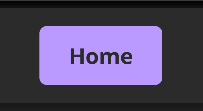
Skelly is not a multi-billion-dollar anti-trust conglomerate full of teams of people who could make that button. He is not a team of people working on the next big startup. He wasn’t paid to make this home button, he wasn’t formally trained to do user experience or user interface design, yet somehow this home button - despite being a light color scheme - is more legible to me than buttons inside a theme specifically designed for people like me. I don’t understand it, I’m tired of it, my head hurts, and I’d like people to try to do better.
What does Skelly do right?
The home button I showed above is legible to me because:
- The font is bold. Despite the light background, the text is bold enough that it is not affected by the light-bleeding effect that causes dark text to look faded to me.
- The background isn’t that bright. It still grabs your attention, and draws your eyes to it, without being near-pure-white or needing to be an obnoxious shade of cyan.
What can be done to fix buttons?
It wouldn’t be fair of me to rant about this agony without offering suggestions to fix it in your own programs/designs.
I understand the idea of these migraine buttons. They indicate either an active page or a primary action. On a dark background, you want to draw the user’s eyes to it.
What you should do:
- Avoid off-whites or pure white. If someone like me enables dark mode, it’s not a preference - we cannot read black on white. So do not use black on white.
- Prefer thicker fonts. This helps improve effective contrast ratios, which is far more important than on-paper ones.
- Try to use a symbolic, solid, monochromatic icon alongside the text. If the text cannot be read, but someone has enough sight left to recognize the shape of an icon, a floppy disk next to the word “save” may give a very huge context clue for the user.
What you could also try:
- Darken the background a bit. See if you can get away with a darker version of your accent color. You don’t need to (and shouldn’t) go below 50% gray in terms of brightness, but stray away from the GitLab and Discourse buttons.
- Try incorporating a border: If done well, a border can help draw attention to the button without needing an impossibly-bright background.
- Remove the background from non-highlighted buttons: If done well, even a really dark background color will draw attention to a primary button.
- Screw background colors, and color the text: Colored text on a neutral background can sometimes be easier to read than neutral text on a colored background. This depends on the person, and the scenario, but there is a reason hyperlinks are traditionally blue.
What you should never do:
Do not color-clash (blue on red), avoid dark-on-dark, and avoid light-on-bright. Contrast is key.
Other things you can try to test your designs:
There are a few things you can try to test your designs to see if they’re readable in different scenarios:
Set your device to full brightness, turn all over lights off, and try to read the button at midnight when your eyes are adjusted to low-light conditions. Wait about 45 minutes in total darkness. Then try to read the button. If you struggle, feel the need to turn down the brightness, or feel pain, then something is wrong with the button’s effective contrast and you should pick different colors.
Some operating systems have colorblind modes that you can apply in display settings. Try your design with these modes active. If things are hard to distinguish or hard to read, there’s a chance an actual colorblind person also struggles to read it.
Try turning on a red-shift or blue-light filter. If the design becomes easier to read, there’s a good chance you need to de-blue the button. Especially at night, the human eye is far more sensitive to blue light and it can be overwhelming for some users. This is why I can’t read cyan buttons.
Try an accessible typeface. A good example is Atkinson Hyperlegible. These typefaces go out of their way to be easier to read for the blind and/or dyslexic. If you’re neither of those but still find the button easier to read, you may consider increasing the font weight of the original font. (Or sticking with the hyperlegible font)
And lastly, ask a blind, visually impared, or dyslexic friend to help test your design. We want the world to be more accessible, and the best person to tell you how to make something accessible is a person who has accessibility needs. You won’t bother us by asking for feedback or advice.
So yeah.
Look out, Microsoft. Because I’m coming for your operating system next.